CSS Experiment: bar graphs
There was an interesting article about website bandwidth usage posted on Hacker News today. It contains some bar graphs explaining which fractions of the total download size of a site home page is attributable to text content, images, CSS, scripts etc. The author said he had "cheated" in creating those bar graphs by taking screen shots from Safari's development console. I figured this was a nice challenge to see if I could recreate those graphs in pure HTML and CSS.
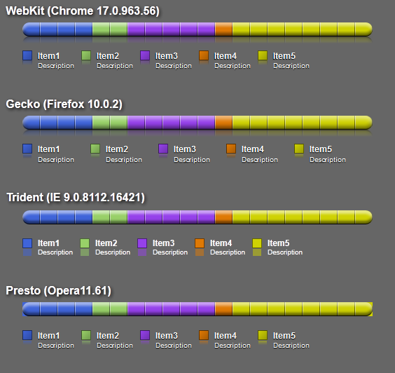
This is what my attempt looks like in the current versions of the major browsers. Here is a live demo to see it in your own browser.
WebKit
WebKit's rendering is the most full-featured. I make use of the extremely proprietary -webkit-box-reflect property for the reflection of the main graph and the patches in the legend. This works nicely, but is unlikely to ever become a standard. One thing you can't see in this screenshot is that WebKit suffers from the problem visible in Opera's rendering. It does not clip the coloured blocks that make up the items to the rounded corners of the main graph. I've worked around this by adding an extra box shadow that is basically the solid background colour. This is targeted to WebKit only, by use of the -webkit-box-shadow property. The box shadows making up the highlight and shadow of the main graph show evidence of some mach banding.
Gecko
Gecko comes second, in my opinion. In this case, I created the reflection using the actual graph as a background image (through the -moz-element(#id) value), overlaying a gradient that fades out to the background colour then flipping it around using a CSS transform. The nasty thing about using the gradient rather than a mask is that it doesn't make the reflection transparent. Using a mask is possible with SVG, but I haven't looked into that. Feross Aboukhadijeh has written a post with more information.
Something weird is going on with the legend, there being seemingly too much padding on the items, resulting in a bit more spacing than usual. I haven't investigated as to what causes this.
Another nasty thing is that the -moz-element(#id) value as a background image requires that the element you're reflecting be specified by ID in the CSS. This makes it not trivial to reuse the HTML without JavaScript trickery or inline styles. Other than that, using another element as a background is a very cool and useful feature. Also, I think Gecko does best at rendering the box shadows, with very smooth blending and very little mach banding.
Trident
Internet explorer isn't half bad. IE9 doesn't support text-shadow and gradients yet, both of which have been implemented in IE10. It also rather nicely clips the item boxes to the graph's rounded corners. No reflections, though and no gradients on the legend patches. Trident renders the blur radius on box shadows quite differently from WebKit and Gecko. This makes the darkest shadow look a bit more crisp than I'd like it to be. You definitely don't want to try this on older versions of Trident, such as used in IE8 or lower and I have made no attempt to even test this code in it.
Presto
The item colours extending outside the graph bar is a bit jarring. Only Gecko and Trident clip the content to the rounded borders. WebKit and Presto do not. With WebKit, I could work around this by adding a drop shadow in the colour of the background around the graph bar. With Opera, this does not appear to be possible by targeting directly. It would be possible by using the same values for box-shadow that I use for -webkit-box-shadow.
Random stuff
The notches, at 25 pixel intervals, are drawn through a PNG background image specified as a data URI. I originally tried a repeating linear gradient, but even when specifying pixel-precise colour stops, all browsers that support those render them incorrectly or blur things even at 100% zoom level. It's not strictly pure CSS this way, but it does have the best rendering and cross-browser support.
The coloured item blocks have their widths specified in percentages. Most browsers calculate the pixel widths and truncate them. Gecko seems to be the only layout engine that uses fractional pixel widths and fills up the entire bar even when the bar is not a multiple of 100 pixels. I believe IE10 will do this as well.
I wish generated content, using :before and :after didn't actually require the content property to be set to an empty string before these things show up. Why isn't display: block; enough?
The linked demo contains all the HTML and CSS code that I wrote for this, with some browser-specific comments in the CSS. Go ahead and play with it.
Comments
Re : http://www.shdon.com/blog/2012/03/05/css-experiment-bar-graphs
I like your bar graph, I would like to use it on my web site.
http://www.lucid-trend.com
My question is do you develop any custom css controls?
Kind regards
Raj
Post a comment